superficial review of top alternatives
After twenty plus years, I’m done with top. Never found it particuarly good at presenting information, what little it has. It’d be great to have disk, filesystem and network information thats easy while pleasant on the eyes
Let’s try!
After a quick search I found short list of replacements. I didn’t wan’t to install them, so I’ll leverage nix to only run them
nix run nixpkgs#atop
nix run nixpkgs#btop
nix run nixokgs#bpytop
nix run nixpkgs#glances
nix run nixpkgs#gtop
nix run nixpkgs#htop
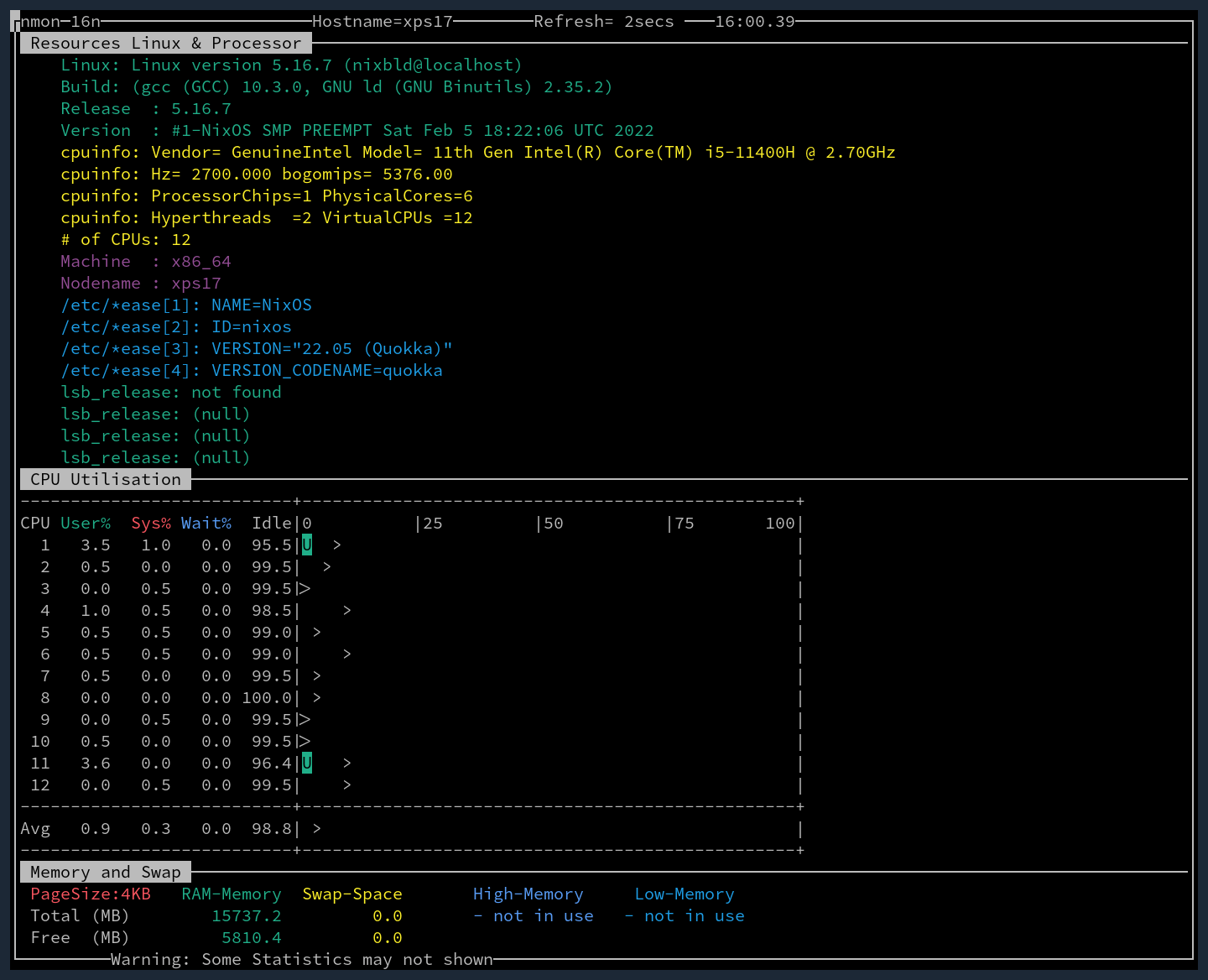
nix run nixpkgs#nmon
atop
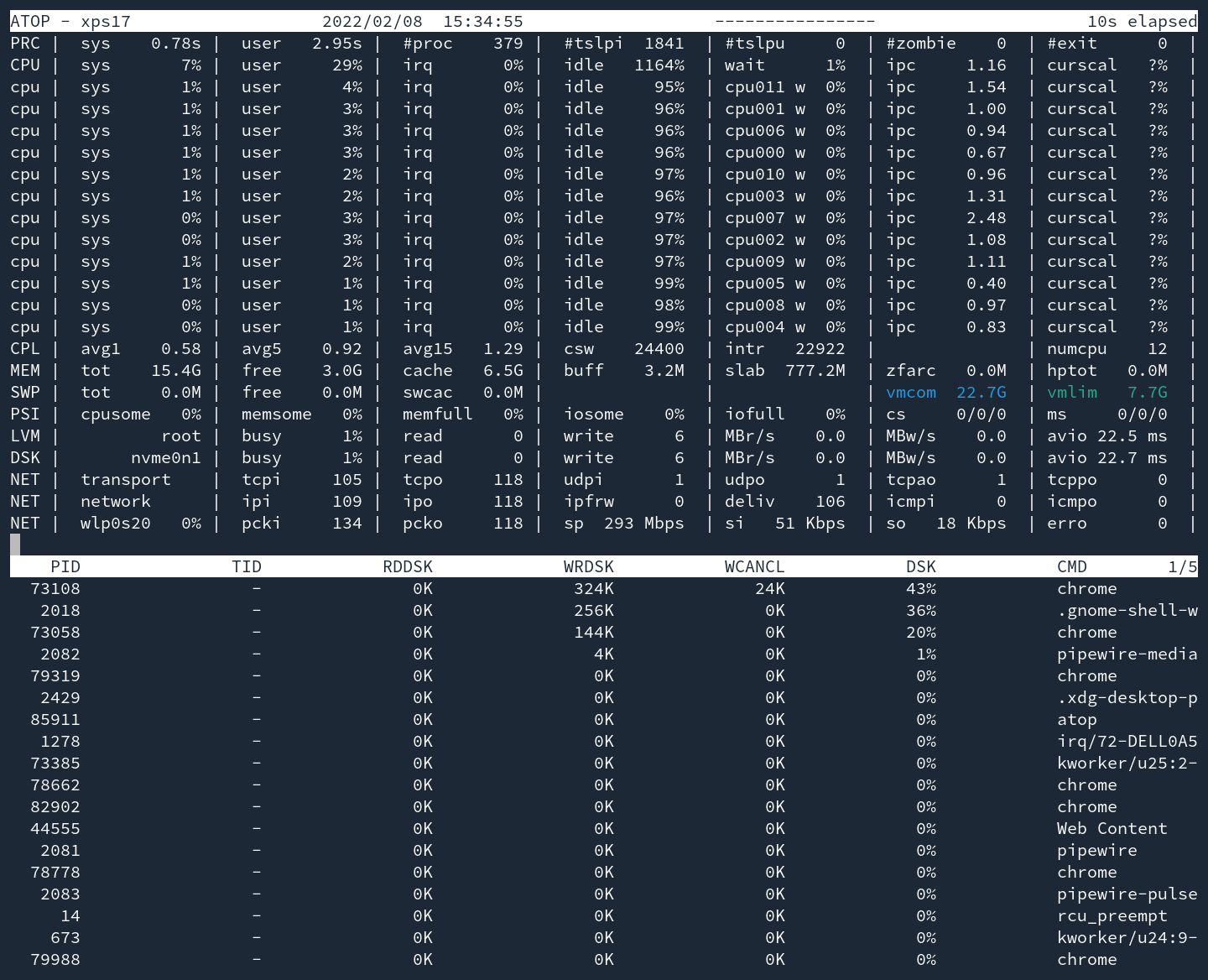
aesthetics: D
300 second usability test: A+
btop

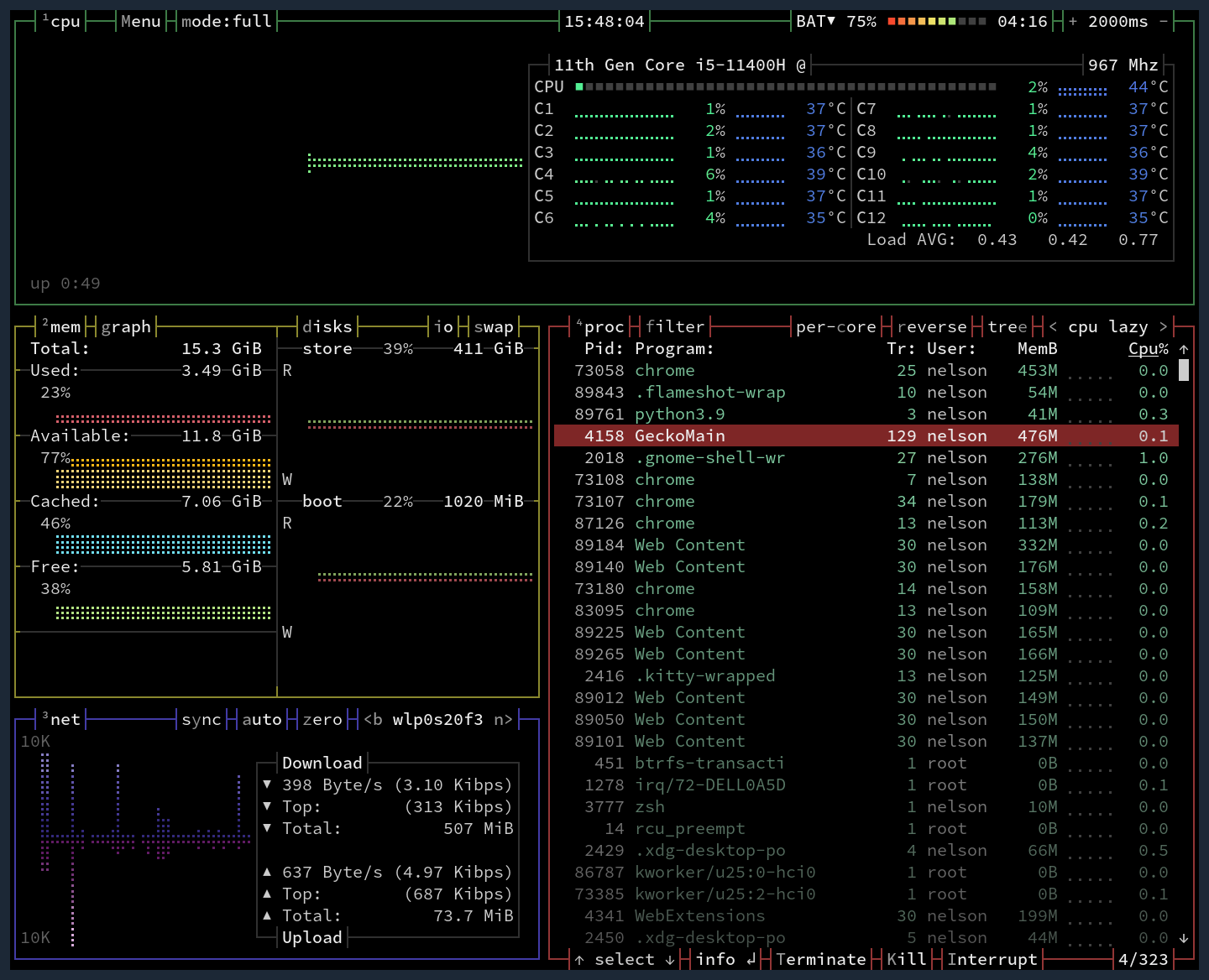
aesthetics: A+
To my eyes, btop has it perfectly. Nice use of color for aesthetics but also used to give compact mesurment of metrics. The subtle dimming of processes further down the list is a nice touch as well
300 second usability test: A+
The second btop opened it was very clear what to press to change what to view or hide. Instantly able to filter on processes. Even has metrics that I did’t expect like remaining batter life, in hours and percent
bpytop
aesthetics: A-
Almost the same as btop but I don’t like the harsh border colors. Otherwise, quite nice
300 second usability test: A+
identiacal as far as I can tell with btop - great in all the ways btop is
glances
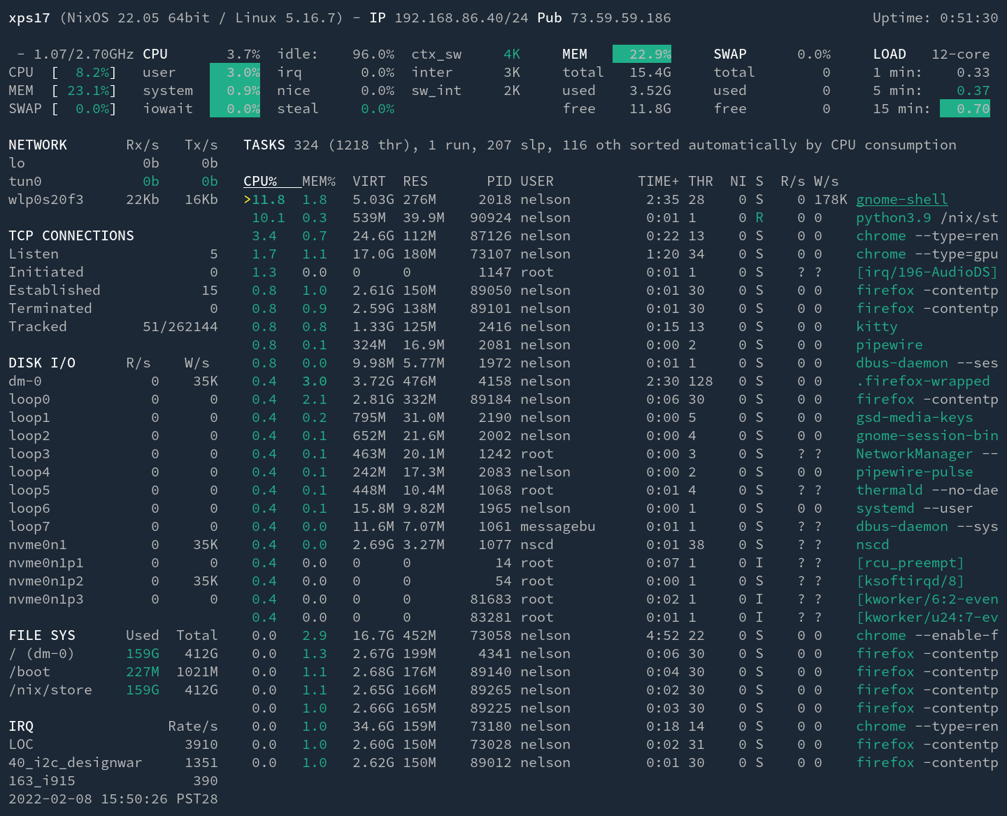
aesthetics:
300 second usability test:
gtop
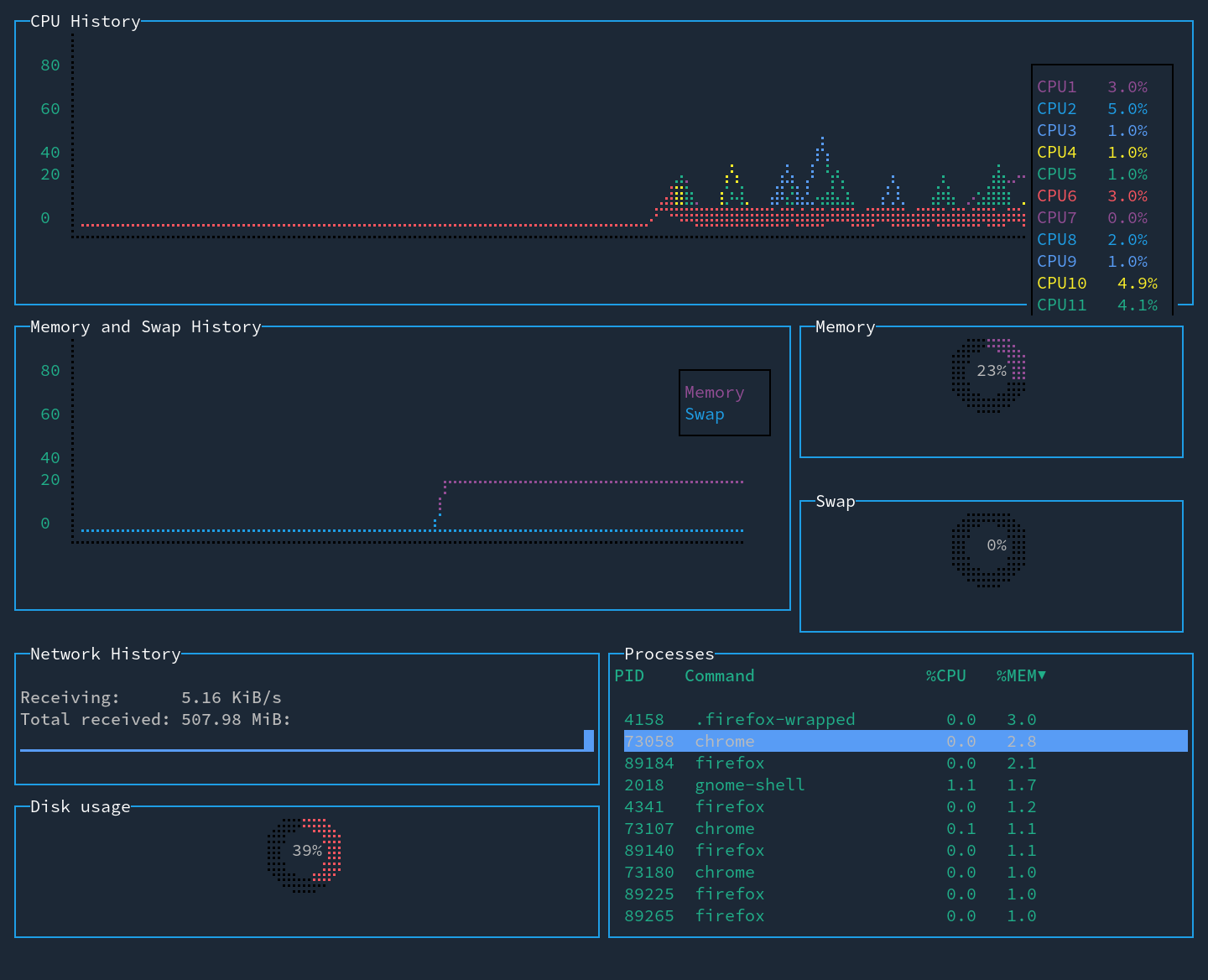
aesthetics:
300 second usability test:
htop
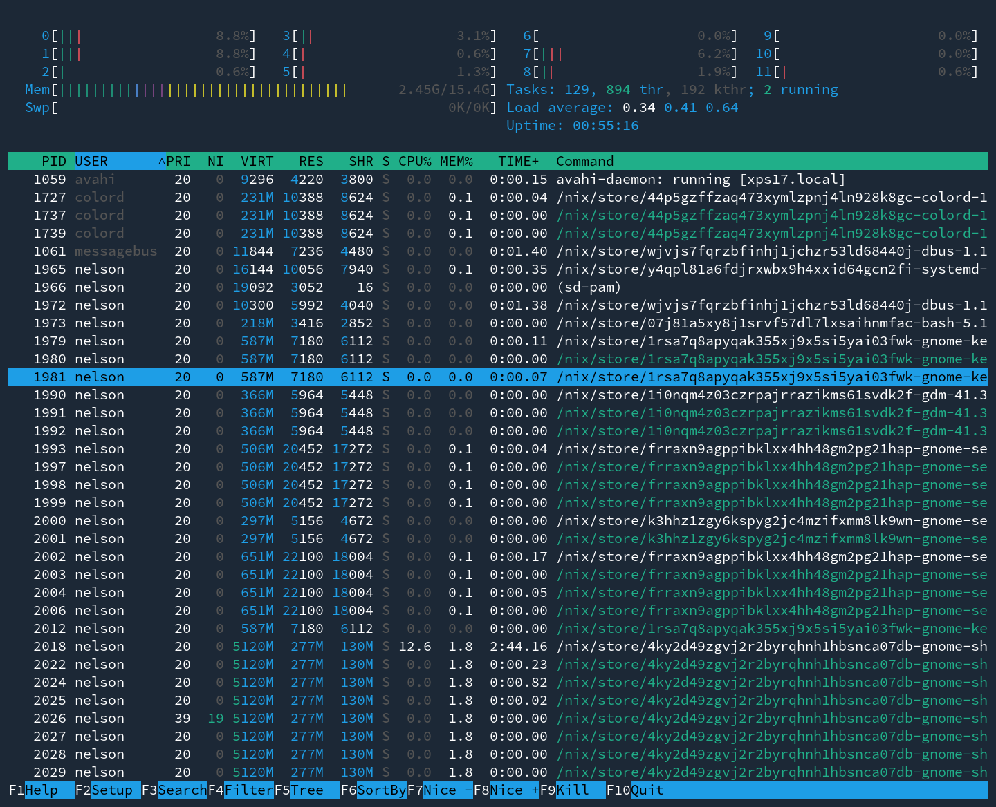
aesthetics:
300 second usability test:
nmon
